In This Topic
Box Elements Overview
Box elements are represented by the NBoxElement abstract class, that derives from the NInputElement abstract class (its features are discussed in the Input Elements topic). It serves as base class for the NWindow and NWidget classes, which are the main building blocks of the NOV UI. There are several main features, which windows and widgets inherit from their common base:
1. Box model - both windows and widgets share a common box model the basics of which are implemented by the NBoxElement class.
2. Measure and Arrange - both windows and widgets share a common set of properties related to their measure and arrange (layout).
3. Appearance - both windows and widgets share a common set of properties related to their appearance.
The rest of this topic discusses these features.
The Box Model
The Box Model implemented by the NBoxElement class takes its origins from the W3C box model (with slight modifications) and is illustrated by the following drawing:
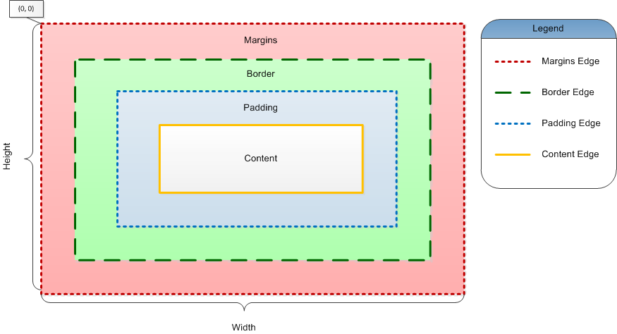
figure 1. The Box Model
As you can see the local coordinate system of each box is split into margins, border, padding and content areas. The perimeter of each of the four areas (Content, Padding, Border, and Margin) is called an "edge", so each box has four edges:
margin edge - the margin edge surrounds the rectangle given by the Width and Height of the box and the (0, 0) point in local coordinates. If the margin has 0 width, the margin edge is the same as the border edge. By default the box does not render content inside the margins area (i.e. the margins area is used to define some white space around the box). By default boxes do not have margins user controllable margins, because windows do not have margins in general. Widgets however expose control over the margins area via their Margins property. For each box element however you can get the size of the margins area via the GetMargins() method.
border edge - the border edge surrounds the box's border area. If the border has 0 width, the border edge is the same as the padding edge. The area enclosed between the border edge and the padding edge is used for the rendering of the box border (see Borders). The border edge rectangle is obtained by the GetBorderEdge() method. The size of the border area is obtained by the GetBorderThickness() method, that by default returns the value of the BorderThickness property.
Different box elements can override the GetBorderThickness() method to additionally pad the box border area. In such cases the BorderThickness property is usually used to control the size of the border wall, rather than the size of the border area itself.
padding edge - the padding edge surrounds the box padding area. If the padding has 0 width, the padding edge is the same as the content edge. The area enclosed between the padding edge and the content edge is used for the rendering of the box background. The padding edge rectangle is obtained by the GetPaddingEdge() method. The size of the padding area is obtained by the GetPadding() method, that by default returns the value of the Padding property.
As with the border area, the GetPadding() method may be overriden by different box elements and to be additionally padded. In such cases the Padding property is usually used to specify some sort of a min padding.
content edge - the content edge surrounds the area of the element content. Its size usually depends on the element content measure (discussed below). The content edge rectangle is obtained by the GetContentEdge() method. Because the content edge is the inner-most edge, the content area is completely defined by the content edge.
The cumulative margins returned by the GetMargins(), GetBorderThickness() and GetPadding() methods are called insets and can be obtained by the GetInsets() method.
A box element by default tries to take such a size, so that its Width and Height are larger than or equal to the sum of its content measure and its insets. If that is not possible, the size of the inset areas are proportionally decreased, so that the area that remains for the content never has negative width or height.
Measure and Arrange
Box elements integrate with the measure and arrange system of DOM documents (described in the Measure and Arrange topic). As part of that integration they implement the INMeasureElement and INArrangeElement interfaces and are thus considered to be targets for both measure and arrange.
Box elements also implement the INMeasureElementParent and INArrangeElementParent interfaces and are thus considered to also be parents for both measure and arrange. The default implementation of the "parent" interfaces simply marks the box element measure and arrange as invalid.
Following is a description of the tasks, that box elements perform during the document measure and arrange evaluation phases.
Measure Phase
During the measure phase, box elements recalculate their default size and desired size.
The desired size of a box element represents the size of the area that the box wants to occupy in its parent. It is exposed by the DesiredWidth and DesiredHeight properties, that are automatically updated during the box measure.
The default size of a box has the meaning of desired size, which is provided in the case that the box has an unlimited arrange area. The default size is exposed by the DefaultWidth and DefaultHeight properties, that are automatically updated during the box measure.
When a box validates its measure it first recalculates default size and then recalculates its desired size. Both the default size and desired size recalculations share the following common measure algorithm, known as the size measure algorithm:
1. If the box PreferredWidth and PreferredHeight are different than Double.NaN, the respective preferred width or height becomes the measure size of the box. This means that you can force a box element to provide "fixed" measure width and/or height, by setting the respective "preferred" size. By default the value of these properties is set to Double.NaN, meaning that the box provides an "automatic" measure. Note that the "fixed measure size" is also subject to the clamping described in step 3.
2. If the box does not have a fixed size, the box measures the size of its content area, by calling the protected virtual NSize MeasureContent(bool defaultMeasure) method, that should return either the default or desired size of the content area, depending on the value of the defaultMeasure parameter. The measure size of the content area is then padded with the box insets (the NMargins returned by the GetInsets() method).
During measure validation the MeasureContent method may be called twice - once to measure the default size and once to measure the desired size of the box content.
Typically the measure of box depends on the measure of its children. In order to use the same code to measure the box children content for default measure - (i.e when the bool defaultMeasure argument of MeasureContent is true), and for desired size measure (i.e. when the bool defaultMeasure argument of MeasureContent is false), you can get the default or desired measure of the child boxes, by calling the box GetMeasure(bool defaultMeasure) method.
3. Finally the measure width is clamped to the range defined by the MinWidth and MaxWidth properties, while the measure height is clamped to the range defined by the MinHeight and MaxHeight properties.
Because the desired size is always calculated after the default size, the box always has a valid default size, when it calculates its desired size. In order for the box to always "desire" to occupy a large enough area in its parent, the desired size measure is additionally padded to include the default size measure.
The latter is also known as the desired size default inflate. It's meaning is that the default size is always a sub size of the desired size. It also means that the desired size of a widget can be different by its default size, only if the widget or any of its descendant widgets has a desired size that is dependant on its arrange slot (see the Widget Elements topic for more information about the arrange slot of a widget).
The desired size default inflate is the default layout stiffening approach integrated in NOV UI. To the best of our knowledge it is implemented only by Nevron, and is therefore one of the Nevron layout inventions.
To better illustrate the result of the default and desired measure, consider a wrap flow layout panel, that needs to be arranged in an area, the width of which is smaller than the width that fits all boxes in a single lane, as illustrated by the following drawing:
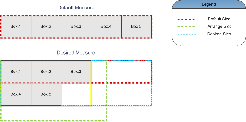
figure 2. Default and Desired Measures
As you can see the wrap flow panel default measure (red dotted box) represents such a size, that fits the boxes in a single lane. The desired measure is more interesting - it needs to take into account the arrange slot (green dotted box). The arrange slot is not large enough in width to fit all boxes in a single lane, and that is why the computed desired size (yellow box), is smaller in width, but larger in height. The actual desired size (blue dotted box) is produced as the union of the default size and the computed desired size.
By default the desired size and default size properties are marked as affecting the parent measure and arrange. Thus when the measure size of a box is changed, the parent box is automatically notified about that change, and typically marks its measure and arrange as invalid.
Arrange Phase
During the arrange phase, box elements need to arrange their content. They achieve that calling the protected virtual void ArrangeContent(NRectangle contentArea), by passing as argument the rectangle returned by the GetContentEdge() method (i.e. the content area).
Box elements generally try to place child boxes at their desired size, however you should remember that it is always the parent box that defines the final arrangement of each child box.
In most cases you will need to override the MeasureContent and ArrangeContent methods in order to implement custom measure and arrange widgets. The following code example demonstrates a custom stack layout widget:
| My Stack Layout Widget |
Copy Code
|
public class MyStackLayoutWidget : NCompositeWidget<NWidget>
{
 public MyStackLayoutWidget() { }
 static MyStackLayoutWidget()
 {
  MyStackLayoutWidgetSchema = NSchema.Create(typeof(MyStackLayoutWidget), NCompositeWidget<NWidget>.NCompositeWidgetSchema);
 }
 protected override NSize MeasureContent(bool defaultMeasure)
 {
  // the box measure width is the max of its children measure widths.
  // the box measure height is the sum of its children measure heights.
  double width = 0;
  double height = 0;
  for (int i = 0; i < Count; i++)
  {
   NWidget childWidget = this[i];
   NSize childSize = childWidget.GetMeasure(defaultMeasure);
   if (childSize.Width > width)
   {
    width = childSize.Width;
   }
   height += childSize.Height;
  }
  return new NSize(width, height);
 }
 protected override void ArrangeContent(NRectangle contentArea)
 {
  // place the child widgets, one after the other in the Y dimension.
  // the arrange slot of each widget has its desired height.
  double curY = contentArea.Y;
  for (int i = 0; i < Count; i++)
  {
   NWidget childWidget = this[i];

   NRectangle arrangeSlot = new NRectangle(contentArea.X, curY, contentArea.Width, childWidget.DesiredHeight);
   childWidget.ArrangeSlot = arrangeSlot;
   curY = arrangeSlot.Bottom;
  }
 }
 public static readonly NSchema MyStackLayoutWidgetSchema;
}
|
See the Widget Elements topic for more information about the arrange slot of a widget.
Appearance
Appearance wise, windows and widgets share the following common features inherited by their common NBoxElement base class.
Border – the appearance of the box border is controlled by the Border property (marked as styleable). By default the box border is displayed inside the border area – hence the thickness of the border is defined by the BorderThickness property. The border wall is provided by the CreateBorderWall method (see Borders for more info).
Background – the filling of the box background area is controlled by the BackgroundFill property, which is marked as styleable. If the widget has no border (i.e. the Border computed value is null), the background fills the rectangle returned by the GetPaddingEdge() method. Otherwise the background area is determined by the border.
Font – the primary font of the box is controlled by the Font property (marked as styleable and inherited). Because this property is inherited, you can generally set a specific font to sub-trees of widgets.
TextFill – the filling of the texts displayed with the primary font is controlled by the TextFill property (marked as styleable and inherited). Because this property is inherited, you can generally set a specific text fill to sub-trees of widgets. Note that NOV texts can be displayed with stroking and shadows too, but this is left to higher level widgets to determine.
Focus Decorator – certain widgets need to be decorated in a specific way, whenever they own the keyboard focus. The decorator used for focus highlight purposes is exposed by the FocusDecorator property (marked as styleable).
The example below demonstrates how to create a label with Khaki background, blue, 2 dips wide, solid border and red text rendered with 16 dips large “Arial” font:
|
Box Element Example
|
Copy Code
|
NLabel label = new NLabel("Hello World");
label.BackgroundFill = new NColorFill(NColor.Khaki);
label.Border = NBorder.CreateFilledBorder(NColor.Blue);
label.BorderThickness = new NMargins(2);
label.Fill = new NColorFill(NColor.Red);
label.Font = new NFont("Arial", 16);
|
The resulting label looks like this:

Another way to modify the appearance of a box element is to override its OnPrePaint(NPaintVisitor visitor) and OnPostPaint(NPaintVisitor visitor) methods, as described by the Painting topic.