Image based themes use stretched images to style the background, borders and other visual aspects of widgets. Images that are used in image based skins are constructed by vertically concatenated state images. The following image illustrates the image used to style the button of a Windows 7 Aero theme:
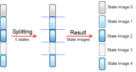
figure 1. State images inside a skin image.
As you can see the image is split vertically into 5 sub images. Each of these sub images represent a given state of the button. A state image is further split into part images that are used as background and border of the widget. The splitting is done by using specified clip margins that define four offsets from the state image rims. The following image illustrates the splitting of a state image to parts images:
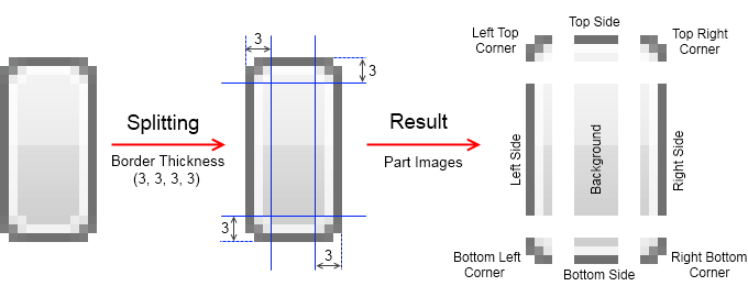
figure 2. State image to parts splitting.
This splitting of each state image is also known as the nine-patch. When rendering a widget with different size the nine-patch scales in accordance the following rules:
- corners are displayed unscaled.
- sides are stretched in the respective dimension - top and bottom sides are stretched only horizontally, while left and right sides are stretched only vertically.
- background is stretched both horizontally and vertically.
The image splitting into states and nine-patch parts is performed by the NImageSkin class. Besides the Colors and Fonts maps, defined by the base NUITheme, the NUIPartSkinsTheme also provides the following maps:
- Skins - is an instance of the NUIThemeSkinMap. Represents a dictionary that contains an instance of the NUIPartSkin class, mapped to a specific widget type (Button, CheckBox etc.).
- TabSkins - is an instance of the NUIThemeTabSkinMap. Represents a dictionary that contains an instance of the NTabSkin class, mapped to a specific tab location (Left, Top etc.). Note that tab skins are also using image skins internally, it is just that the skins for the different tab location are usually automatically generated from the base tabs image (corresponds to the Top tab location).