In This Topic
The ribbon group is the main building block of a ribbon tab page. It is the container in which ribbon buttons, menus, split buttons, galleries, combo boxes and other widgets are placed. To add/remove items to a ribbon group you should use its Items collection.
States
A ribbon group typically has 4 states:
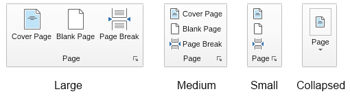
In the Collapsed state the ribbon group's content is replaced with a drop down with an icon and text, which when clicked shows the content of the ribbon group in a popup window. The icon shown in the collapsed state can be set through the Icon property of the ribbon group and the text is the text of the ribbon group's header.
The current state of the group is indicated by the CurrentState property and is automatically updated by Nevron during the tab page groups layout process. You can use the InitialState property to specify the default size of the group, which defines the maximum size the group can be in. The layout always puts groups in their InitialState if there's enough space available.
The InitialState and CurrentState properties are of integer type in order to allow a practically unlimited number of ribbon group states, but you can use the ENRibbonGroupState enumeration for the commonly used 4 states as the code example below demonstrates.
| Setting Ribbon Group Initial State |
Copy Code
|
NRibbonGroup ribbonGroup = new NRibbonGroup("Group Title");
ribbonGroup.InitialState = (int)ENRibbonGroupState.Medium;
|
By default the InitialState of ribbon groups is set to Large.
Parts
A ribbon group consists of 2 parts: a header and a collection of items. The header is placed at the bottom of the group and has a title label and a dialog launcher button. The latter is used to launch a dialog window, which contains additional information and settings related to the ribbon group. If you want to hide the dialog launched button, you can do so by simply setting its Visibility to Hidden:
| Hiding of the Dialog Launcher Button |
Copy Code
|
group.Header.DialogLauncherButton.Visibility = ENVisibility.Hidden;
|
You can use the Items collection to populate the ribbon group with widgets. Any widget can be placed in a ribbon group, but if you want to take advantage of the ribbon dynamic sizing features its is recommended that you use mainly widgets that implement the INRibbonWidget interface, such as ribbon buttons, ribbon split buttons, ribbon panels, ribbon galleries, etc. The following code snippet demonstrates how to create the ribbon group from the previous section:
| Create Ribbon Group |
Copy Code
|
NRibbonGroup group = new NRibbonGroup("Page");
group.Icon = NResources.Image_16x16_cover_page_png;

NRibbonCollapsiblePanel panel = new NRibbonCollapsiblePanel();
group.Items.Add(panel);

NRibbonButton button = new NRibbonButton("Cover Page");
button.LargeImage = NResources.Image_32x32_cover_page_png;
button.SmallImage = NResources.Image_16x16_cover_page_png;
panel.Add(button);

button = new NRibbonButton("Blank Page");
button.LargeImage = NResources.Image_32x32_page_png;
button.SmallImage = NResources.Image_16x16_page_png;
panel.Add(button);

button = new NRibbonButton("Page Break");
button.LargeImage = NResources.Image_32x32_page_break_png;
button.SmallImage = NResources.Image_16x16_page_break_png;
panel.Add(button);

page.Groups.Add(group);
|
Note how the ribbon buttons are placed in a ribbon collapsible panel. This is a special kind of layout panel that implements the INRibbonWidget interface and changes its direction from "right to left" to "top to bottom" when going from large to medium state, which achieves the effect shown in the image from the previous section.
See Also