Menu split buttons are split buttons that popup a menu. You can add/remove items by using the Items property of the menu split button. The content of this type of split button is an instance of the NMenu class and the Items property of the split buttons is just a reference to the Items collection of this menu instance. The menu split button uses the header of the currently selected menu item for the content of its action button. That is why it is important the menu items you add to the menu split button to have header.
The NMenuSplitButton class contains two factory methods that let you easily populate the menu of the split button - FillFromEnum and FillFromArray. These methods function similarly to those of the NComboBox, i.e. they create items and stores the value each item was created for in its Tag property. The only difference is that in the context of menu split buttons these methods also require an array of headers, which are used to create the header widgets of the menu items. The number of headers should be equal to the number of array/enum values.
The index of the currently selected item can be get/set through the SelectedIndex property. When it changes, the SelectedIndexChanged event is fired. You can use the SelectedValue property to get the value that corresponds to the currently selected menu item. It uses the Tag property of the currently selected menu item to obtain the value. That is why if you do not use the factory methods FillFromEnum or FillFromArray, you should set the Tag property of each of the menu items to the value the menu item represents.
The following code example demonstrates how to create a menu split button and populate it with items using the FillFromEnum factory method. The code also shows how to handle the SelectedIndexChanged event of the menu split button:
| Menu Split Button Example |
Copy Code
|
|---|---|
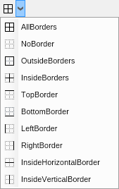
NImage[] BorderSideImages = new NImage[] { NResources.Image_Table_Borders_AllBorders_png, NResources.Image_Table_Borders_NoBorder_png, NResources.Image_Table_Borders_OutsideBorders_png, NResources.Image_Table_Borders_InsideBorders_png, NResources.Image_Table_Borders_TopBorder_png, NResources.Image_Table_Borders_BottomBorder_png, NResources.Image_Table_Borders_LeftBorder_png, NResources.Image_Table_Borders_RightBorder_png, NResources.Image_Table_Borders_InsideHorizontalBorder_png, NResources.Image_Table_Borders_InsideVerticalBorder_png }; NMenuSplitButton borderSidesSplitButton = new NMenuSplitButton(); borderSidesSplitButton.FillFromEnum<ENTableBorders, NImage>(BorderSideImages); borderSidesSplitButton.SelectedIndexChanged += OnBorderSideChanged; private void OnBorderSettingChanged(NValueChangeEventArgs arg) { NMenuSplitButton menuSplitButton = (NMenuSplitButton)arg.CurrentTargetNode; ENTableBorders selectedSide = (ENTableBorders)menuSplitButton.SelectedValue; } |
|
The code will result in the following menu split button: