In This Topic
The splitter is a widget that splits its content area into resizable panes, which can be interactively resized with help of a thumb. Nevron Open Vision provides two splitter widget, which both inherit the class NSplitterBase:
- Splitter - splits its content area into 2 resizable panes.
- Multi-splitter - splits its content area into 2 or more resizable panes.
Properties
The splitter provides the following properties:
- Pane1 and Pane2 - content elements that represent the panes of the splitter.
- Thumb - represents the thumb of the splitter.
- Orientation - specifies whether the splitter is horizontal or vertical.
- ResizeStep - determines the step with which the current splitter position can be changed. Through the ResizeWhileDragging property you can control whether to resize the panes while the thumb is being dragged or not. When set to false the panes are resized when the thumb is released. By default set to false.
The multi-splitter provides the following properties:
- Widgets - the collection of widgets contained by the multi-splitter. You should add splitter panes and splitter thumbs to this collection.
Splitter thumb provides the following properties:
-
SplitMode - controls how the splitter splits its content area. Can be one of the following:
| Split Mode |
Description |
| Proportional |
The splitter’s thumb position is defined proportionally to the respective dimension (Width or Height, depending on splitter orientation). |
| OffsetFromNearSide |
The splitter's thumb position is defined with a constant distance from the near side (Left or Top, depending on splitter orientation). This is the default value. |
| OffsetFromFarSide |
The splitter's thumb position is defined with a constant distance from the far side (Right or Bottom, depending on splitter orientation). |
- SplitOffset - defines the fixed length offset at which to split. When SplitMode is set to OffsetFromNearSide, this defines the near side of the layout direction (e.g. when Vertical is false, this is the Left side). When SplitMode is set to OffsetFromFarSide, this defines the far side of the layout direction (e.g. when Vertical is false, this is the Right side). The value of this property is not used when SplitMode is set to Proportional. When set to NaN the splitter uses the panes desired width/height in the layout direction to find a suitable a replacement. By default set to NaN.
- SplitFactor - controls the proportion factor at which to split. Used only when SplitMode is set to Proportional. Valid values are in the range [0, 1] (e.g. a value of 0.5 means split at the center). When set to NaN the splitter uses the panes desired width/height in the layout direction to find a suitable a replacement. By default set to NaN.
-
CollapseMode - the collapse mode of the splitter, which determines the visibility of the thumb buttons. By default set to None. Can be one of the following:
| Collapse Mode |
Description |
| None |
The splitter thumb buttons are hidden. |
| PreviousPane |
The "Collapse Previous Pane" splitter thumb button is visible. |
| NextPane |
The "Collapse Next Pane" splitter thumb button is visible. |
| BothPanes |
Both the "Collapse Previous Pane" and the "Collapse Next Pane" splitter thumb buttons are visible. |
Splitter Panes Minimum Size
If you want to limit the dragging of the splitter thumb in order to disable the full collapsing of one or both of the splitter panes, you should set the MinWidth of one or both splitter panes for horizontal splitters and the MinHeight of one or both splitter panes for vertical splitters. The splitter won't allow the user to collapse the panes more than their minimum size.
The MinWidth and MinHeight properties are ignored by the splitter thumb buttons, which are displayed when the CollapseMode property of the splitter is different from None. Thus splitter thumb buttons can always collapse splitter panes completely, no matter their minimum size.
The following code demonstrates how to set the MinWidth of the left pane of a horizontal splitter to 100 DIPs (device independent pixels). Thus the user won't be able to collapse the left pane to less than 100 DIPs by dragging the splitter thumb. He will be able to collapse the left pane completely by clicking the collapse splitter thumb button:
| Splitter with a pane with minimum size |
Copy Code
|
NSplitter splitter = new NSplitter();
splitter.Orientation = ENHVOrientation.Horizontal;
splitter.Pane1.Content = new NLabel("Left Pane");
splitter.Pane2.Content = new NLabel("Right Pane");

// Limit collapse via thumb dragging of the left splitter pane
splitter.Pane1.MinWidth = 100;

// Show a button that can collapse the left splitter pane completely no matter its min width
splitter.Thumb.CollapseMode = ENSplitterCollapseMode.PreviousPane;
|
Splitter Code Example
The following example demonstrates how to create a splitter and set the minimum sizes of its planes. The planes have borders and a solid background, so that you can easily distinguish them:
| Splitter Example |
Copy Code
|
NSplitter splitter = new NSplitter();

splitter.Pane1.Content = new NLabel("Pane1 Min Width/Height = 100");
splitter.Pane1.Background = new NBackground(NColor.LightGreen);
splitter.Pane1.Border = NBorder.CreateFilledBorder(NColor.Black);
splitter.Pane1.BorderThickness = new NMargins(1);
splitter.Pane1.MinWidth = 100;
splitter.Pane1.MinHeight = 100;

splitter.Pane2.Content = new NLabel("Pane2 Min Width/Height = 200");
splitter.Pane2.Background = new NBackground(NColor.LightBlue);
splitter.Pane2.Border = NBorder.CreateFilledBorder(NColor.Black);
splitter.Pane2.BorderThickness = new NMargins(1);
splitter.Pane2.MinWidth = 200;
splitter.Pane2.MinHeight = 200;

splitter.ResizeStep = 20;
|
The result of this piece of code will be:
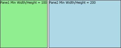
Because of the set minimum size constraints, the splitter will not allow you to move its thumb so that there are less than 100 dips on left side of the splitter or less than 200 dips on its right side.
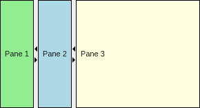
Multi-splitter Code Example
The following example demonstrates how to create and configure a multi-splitter:
| Multi-splitter Example |
Copy Code
|
NMultiSplitter multiSplitter = new NMultiSplitter();

NSplitterPane pane1 = new NSplitterPane();
pane1.Padding = new NMargins(NDesign.HorizontalSpacing, NDesign.VerticalSpacing);
pane1.BackgroundFill = new NColorFill(NColor.LightGreen);
pane1.Border = NBorder.CreateFilledBorder(NColor.Black);
pane1.BorderThickness = new NMargins(1);
pane1.Content = new NLabel("Pane 1");
multiSplitter.Widgets.Add(pane1);

NSplitterThumb thumb1 = new NSplitterThumb();
thumb1.CollapseMode = ENSplitterCollapseMode.BothPanes;
multiSplitter.Widgets.Add(thumb1);

NSplitterPane pane2 = new NSplitterPane();
pane2.Padding = new NMargins(NDesign.HorizontalSpacing, NDesign.VerticalSpacing);
pane2.BackgroundFill = new NColorFill(NColor.LightBlue);
pane2.Border = NBorder.CreateFilledBorder(NColor.Black);
pane2.BorderThickness = new NMargins(1);
pane2.Content = new NLabel("Pane 2");
multiSplitter.Widgets.Add(pane2);

NSplitterThumb thumb2 = new NSplitterThumb();
thumb2.CollapseMode = ENSplitterCollapseMode.BothPanes;
multiSplitter.Widgets.Add(thumb2);

NSplitterPane pane3 = new NSplitterPane();
pane3.Padding = new NMargins(NDesign.HorizontalSpacing, NDesign.VerticalSpacing);
pane3.BackgroundFill = new NColorFill(NColor.LightYellow);
pane3.Border = NBorder.CreateFilledBorder(NColor.Black);
pane3.BorderThickness = new NMargins(1);
pane3.Content = new NLabel("Pane 3");
multiSplitter.Widgets.Add(pane3);
|
The result of this piece of code will be: