Ribbon Overview
In This Topic
Nevron Open Vision's ribbon is a widget that lets developers easily enrich their applications with Microsoft Office like ribbon UI. NOV ribbon is fully customizable and scales its child widgets automatically based on the available area. The resizing of the ribbon is fully customizable, too.
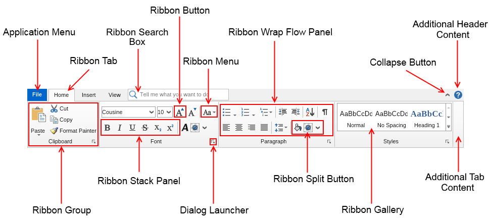
The image below illustrates how a typical ribbon looks and what are the names of its main parts:

As the image above shows, a NOV ribbon consists of the following main elements:
- Application Menu - contains application specific menu options and buttons, equivalent to the File menu in traditional menu based UIs.
- Ribbon Tab - the main part of a ribbon. Contains the tab pages of the ribbon, the application menu, the ribbon collapse button and the optional ribbon search box and additional (top right) content of the ribbon.
- Collapse Button - a button that can be used to collapse/expand the ribbon widgets. When the ribbon is collapsed, the content of its tab pages is not visible.
- Additional Header Content - the content next to the collapse button. This most commonly is a help button, but can be any widget.
- Ribbon Group - the main building block of a ribbon tab page. The ribbon group is the container in which ribbon buttons, menus, split buttons, galleries, combo boxes and other widgets are placed.
- Additional Tab Content - the content next to the last ribbon group. This most commonly is an image box with a logo, but can be any widget.
- Dialog Launcher - a button in the header of a ribbon group, which when clicked opens a dialog window that contains additional information and settings related to the ribbon group.
- Ribbon Wrap Flow Panel - places widgets on two or three lanes.
- Ribbon Stack Panel - groups several widgets together. This panel is typically used in a ribbon wrap flow panel in order to prevent a set of widgets to break on several lanes.
- Ribbon Button - extends the regular buttons with support for ribbon widget states and large and small images.
- Ribbon Split Button - extends the regular split buttons with support for ribbon widget states and large and small images.
- Ribbon Menu - extends the regular drop down menus with support for ribbon widget states and large and small images.
- Ribbon Gallery - represents a scrollable list of items, each of which shows visually the result of clicking it.
All code examples in the Ribbon chapter assume that the images used are added as resources to the project. For more information about resources, check out the Resources topic.
