Timeline scale
In This Topic
Timeline scales allow you to configure a scale to display date/time information by decorating the scale using several date/time units. By doing this the scale becomes more informative to the end user as it allows him/her to view important date/time events that happen inside the date/time range displayed by the scale.
To illustrate this lets consider a date time range spanning several months - from [November, 11, 2008] to [January ,11, 2009]. One way to denote this range on a chart is by using a standard date/time scale with date formatting:
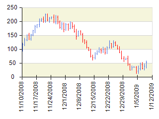
Although this date/time annotation is correct, it is not very informative because it does not emphasize important date/time events on the scale, such as changes in month or year. Additionally, it is inefficient to display the month and year for every date, since these values change infrequently — in the example above, eight labels share the same year (2008), and five labels share the same month (December).
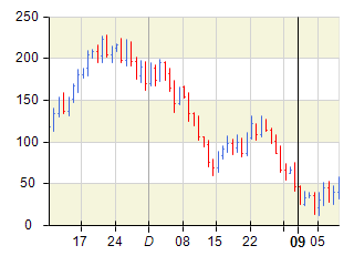
To address this, you can use a timeline scale, which allows you to decorate the scale with multiple date/time units. The following images illustrate how the same date/time range is rendered using a value timeline scale and a range timeline scale.
| Value Timeline Scale (represented by the NValueTimelineScale class) |
Range Timeline Scale (represented by the NRangeTimelineScale class) |
 |
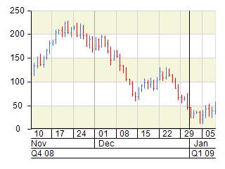 |
Note that this time the scale is decorated in a way that preserves important date and time events. On both scales, the date/time range is sampled using week, month, and quarter-year units with a step of one. Although the annotations appear nearly identical, you may notice that the week starting on December 29 is not labeled on the first scale. This occurs because the scale determined that the label would visually overlap with the start of 2009, which is considered more significant since it marks the beginning of a new year rather than a week.
In general, value timeline scales are preferred when the chart has to be more compact. They use concise date/time formatting to produce shorter labels. Range timeline scales, on the other hand, allow you to display more detailed date/time information without label overlap, though they require more visual space.
As shown in the range timeline scale example above, timeline scales typically consist of three scale levels, each sampled with a date/time unit (automatically selected by default) and a step of one. The value timeline scale follows the same approach but combines these levels into a single visual layer instead of displaying them separately.
Each level in a timeline scale is represented by an instance of the NValueTimelineScaleRow or NRangeTimelineScaleRow classes, depending on the type of timeline scale. The following sections describe how to perform the most common customization tasks with timeline scales.
Creating a Timeline Scale
You create a timeline scale by creating an instance of the NValueTimelineScale or NRangeTimelineScale classes. The following code shows how to create a value timeline scale and assign it to the primary X axis of a standard Cartesian chart:
| C# |
Copy Code
|
|
NCartesianChart chart = (NCartesianChart)chartView.Surface.Charts[0];
NValueTimelineScale valueTimelineScale = new NValueTimelineScale();
valueTimelineScale.FirstRow.GridLines.SetShowAtWall(ENChartWall.Back, true);
valueTimelineScale.SecondRow.GridLines.SetShowAtWall(ENChartWall.Back, true);
valueTimelineScale.ThirdRow.GridLines.SetShowAtWall(ENChartWall.Back, true);
chart.Axes[ENCartesianAxis.PrimaryX].Scale = valueTimelineScale;
|
Controlling the Date Time Units
By default timeline scales can choose from the following date/time units: Century, Decade, Year, HalfYear, Quarter, Month, Week, Day, HalfDay, Hour, Minute, Second and Millisecond. In some cases you may want to disable certain date/time units - for example you may wish to restrict the scale not to use quarter year or half year when decorating. This is done by modifying the AutoDateTimeUnits array:
| C# |
Copy Code
|
|
timelineScale.AutoDateTimeUnits = new NDomArray<NDateTimeUnit>(new NDateTimeUnit[] { NDateTimeUnit.Century,
NDateTimeUnit.Decade,
NDateTimeUnit.Year,
NDateTimeUnit.Month,
NDateTimeUnit.Week,
NDateTimeUnit.Day,
NDateTimeUnit.HalfDay,
NDateTimeUnit.Hour,
NDateTimeUnit.Minute,
NDateTimeUnit.Second,
NDateTimeUnit.Millisecond } );
|
Timeline Rows
The timeline scale consists of several rows, where each row can create scale labels based on a different date time unit and with different appearance settings (font, size, etc.). The following code shows how to hide the third row of a range timeline scale as well as how to modify the filling of labels in the second row:
| C# |
Copy Code
|
|
NCartesianChart chart = (NCartesianChart)chartView.Surface.Charts[0];
NRangeTimelineScale timelineScale = new NRangeTimelineScale();
timelineScale.AutoDateTimeUnits = new NDomArray<NDateTimeUnit>(new NDateTimeUnit[] { NDateTimeUnit.Century,
NDateTimeUnit.Decade,
NDateTimeUnit.Year,
NDateTimeUnit.Month,
NDateTimeUnit.Week,
NDateTimeUnit.Day,
NDateTimeUnit.HalfDay,
NDateTimeUnit.Hour,
NDateTimeUnit.Minute,
NDateTimeUnit.Second,
NDateTimeUnit.Millisecond });
timelineScale.ThirdRow.Visible = false;
timelineScale.SecondRow.Labels.Style.TextStyle.Fill = new NColorFill(NColor.DarkRed);
timelineScale.SecondRow.Labels.Style.TextStyle.Font = new NFont("Arial", 13);
chart.Axes[ENCartesianAxis.PrimaryX].Scale = timelineScale;
|
Working Calendar
Both the range and value timeline scales support the work calendar feature. For more information check out the Work Calendar topic.