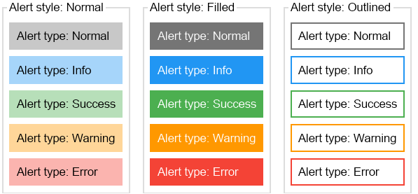
The alert widget is a special label, which can quickly be styled via its Style and Type properties and lets developers quickly show messages, warnings and errors in their applications. The Style property determines whether the alert is filled or has only an outline and the Type property determines the color of the alert's fill and stroke (outline) style. The following image shows the possible alert style and type combinations:
The code below demonstrates how to create a normal warning alert in two ways - via properties and via the constructor:
| Create alerts |
Copy Code
|
|---|---|
// 1. Create a warning alert by setting properties NAlert alert1 = new NAlert(); alert1.Text = "This is a warning"; alert1.Type = ENAlertType.Warning; alert1.Style = ENAlertStyle.Normal; // 2. Create a warning alert using the constructor NAlert alert2 = new NAlert("This is a warning", ENAlertType.Warning, ENAlertStyle.Normal); |
|