The NRangeLabelStyle class associated with range labels builds on top of the functionality provided by the NScaleLabelStyle base class by adding features specific to range labels. The following sections describe those features.
Since range labels denote a range on the scale it is possible to determine the maximum width for each range label. The way in which the label fits that space is specified from the label FitMode property, which accepts values from the ENRangeLabelFitMode enumeration. The following table shows the available options:
| None |
The label does not try to auto fit |
| Wrap |
The label wraps in the specified range |
| Clip |
The label is clipped in the specified range |
| AutoFlip |
The label will automatically flip |
| AutoScale |
The label will automatically scale |
The following code shows how to apply wrapping to a range label:
| C# |
Copy Code
|
rangeScaleLabelStyle.FitMode = ENRangeLabelFitMode.Wrap;
|
Each range label will also generate a range tick on the scale that pinpoints the range denoted by the range. You can control the tick mode by changing the TickMode property of the NRangeScaleLabel class. The following table shows the available options:
| ENRangeLabelTickMode |
Description |
| None |
The range label does not render ticks |
| Separators |
The range label tick is visualized as two separators at the left and right of the range annotated by the label |
| Top |
The range label tick is attached to the top of the label (this is the default) |
| Center |
The range label tick is attached to the center of the label |
Hierarchical and range timeline scales use ENRangeLabelTickMode.Separators by default.
The following code shows hot to change the range label tick mode of a custom range label:
| C# |
Copy Code
|
NCustomRangeLabel customLabel = new NCustomRangeLabel();
customLabel.Range = new NRange(20, 40);
customLabel.Text = "Some Text";
customLabel.LabelStyle.TickMode = ENRangeLabelTickMode.Separators;
someScale.CustomLabels.Add(customLabel);
|
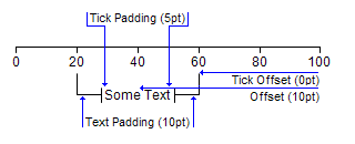
The TickPadding, TickOffset, TextPadding and Offset properties work together to determine the offset of the range tick lines from the text as well as the vertical position of the range tick lines and text on the scale. They have different meaning depending on the tick mode. The following pictures show how these properties work together depending on the TickMode of the label:
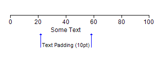
| ENRangeLabelTickMode.None - in this mode only TextPadding and Offset properties have any effect (as the label will not show a range tick). The picture below shows how text padding has limited the available space for the label. If the label uses wrapping if will fit in the range denoted by the blue lines: |
 |
| ENRangeLabelTickMode.Top - in this mode TickPadding, TickOffset, TextOffset and Offset properties work together to determine the label appearance as shown on the picture below: |
 |
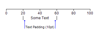
| ENRangeLabelTickMode.Separators - this mode is similar to ENRangeLabelTickMode.None as only the TextPadding and Offset properties are regarded. The blue lines on the picture below show the available space for the label text. If the label does not use wrapping and is longer than the range then the separators will be hidden. |
 |
| ENRangeLabelTickMode.Center – in this mode TickOffset, Offset and TextPadding have the same meaning as when the label ticks operate in RangeLabelTickMode.Top. The TickPadding property in this case is used to control the distance of the center lines from the label text as shown on the picture below: |
 |
The following code creates the label on the last picture (showing RangeLabelTickMode.Center):
| C# |
Copy Code
|
NCustomRangeLabel customLabel = new NCustomRangeLabel();
customLabel.Range = new NRange(20, 60);
customLabel.Text = "Some Text";
customLabel.LabelStyle.FitMode = ENRangeLabelFitMode.Wrap;
customLabel.LabelStyle.TickMode = ENRangeLabelTickMode.Center;
customLabel.LabelStyle.Offset = 10;
customLabel.LabelStyle.TextPadding = 10;
customLabel.LabelStyle.TickOffset = 0;
customLabel.LabelStyle.TickPadding = 5;
|
