NOV UI Borders generally follow the W3C CSS Borders recommendation, with some extensions. In NOV UI a border is divided into two distinct components:
- Border Wall
- NBorder Attribute
The border wall defines the geometry of the border. The NBorder attribute defines the appearance (display style) of this geometry.
The Border Wall is a sequence of rectangles, each associated with a specific border brick type. A border wall in this way defines the general geometry of the border. The most common rectangular box wall is created by this code:
| Create a simle Box Wall |
Copy Code
|
// create a closed box wall
NBorderWall wall = new NBorderWall(true);
// add bricks to the wall.
wall.AddLeftTopCorner(new NRectangle(0, 0, 5, 5));
wall.AddTopSide(new NRectangle(5, 0, 90, 5));
wall.AddTopRightCorner(new NRectangle(95, 0, 5, 5));
wall.AddRightSide(new NRectangle(95, 5, 5, 90));
wall.AddRightBottomCorner(new NRectangle(95, 95, 5, 5));
wall.AddBottomSide(new NRectangle(5, 95, 90, 5));
wall.AddBottomLeftCorner(new NRectangle(0, 95, 5, 5));
wall.AddLeftSide(new NRectangle(0, 5, 5, 90));
|
which is equivalent to making the border wall by using the NBorderWall.CreateBoxWall helper:
| Create a simle Box Wall |
Copy Code
|
// create a simple box wall, that has the specified sides thickness and outer edge
NMargins borderThickness = new NMargins(5, 5, 5, 5);
NRectangle outer = new NRectangle(0, 0, 100, 100);
NRectangle inner = outer;
inner.Deflate(borderThickness);
NBorderWall wall = NBorderWall.CreateBoxWall(outer, inner);
|
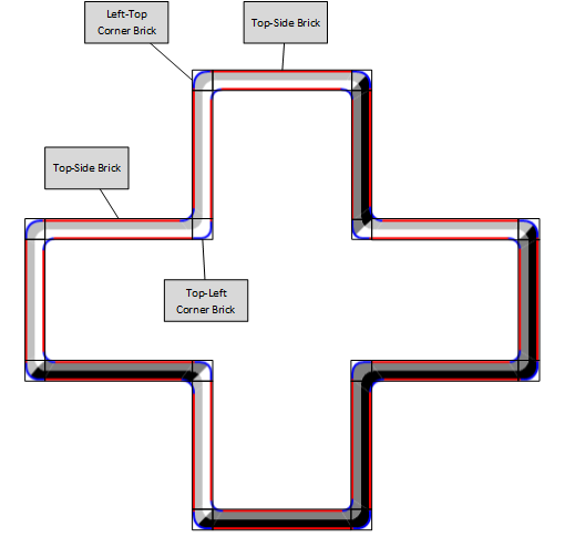
To make a closed rectangular border you need 4 types of corners and 4 types of sides. However in order to all more complex geometry drawings with borders, NOV UI provides 4 additional corner types, plus the ability to create open border walls. This allows you to make very complex border walls – like this one:

figure 1. Cross drawn with a Border Wall.
So in summary you have 8 types of corner bricks – one for each possible side-to-side transition:
LeftTopCorner - joins left and top sides sequence
TopLeftCorner - joins top and left sides sequence
LeftBottomCorner - joins left and bottom sides sequence
BottomLeftCorner - joins bottom and left sides sequence
RightTopCorner - joins right and top sides sequence
TopRightCorner - joins top and right sides sequence
RightBottomCorner - joins right and bottom sides sequence
BottomRightCorner - joins bottom and right sides sequence
And four types of sides:
LeftSide - oriented upwards - outer outline on left
RightSide - oriented downwards - outer outline on right
TopSide - oriented left-to-right - outer outline on top
BottomSide - oriented right-to-left - outer outline on bottom
In NOV UI the border wall is typically rectangular in nature. The border wall for each NBoxElement, is provided by the virtual CreateBorderWall method, which you can override, if you want your widget to have a custom border wall. The default implementation of this method returns a rectangular border wall, which has the thickness of the box border area. Following is the default implementation of the NBoxElement-CreateBorderWall method:
| Default Box Wall |
Copy Code
|
protected virtual NBorderWall CreateBorderWall()
{
    NRectangle outer = GetBorderEdge();
    NRectangle inner = GetPaddingEdge();
    return NBorderWall.CreateBoxWall(outer, inner, m_Cache);
}
|
By default the border wall fills the area occupiend border wall of a box element is as thick as the value of the BorderThickness property.
The NBoxElement-Border property exposes an instance of the NBorder class (derived from NAttribute) that is used to define the appearance of the box element border wall. The NBorder controls the apperance of the border wall in two ways:
1. General Border Apperance
The general border wall appearance includes:
Filling - the homogenous filling of the entire border wall is controlled by the NBorder-Fill property
Stroking - each border wall can produce three outlines - inner, outer and middle. The stroking of these outlines is controlled by the InnerStroke, OuterStroke and MiddleStroke properties of NBorder.
The following example creates a border that is filled with solid blue color and strokes its inner and outer outlines with green and red colors respectively:
| General Border Appearance |
Copy Code
|
NBorder border = new NBorder();
border.Fill = new NColorFill(NColor.Blue);
border.InnerStroke = new NStroke(1, NColor.Green);
border.OuterStroke = new NStroke(1, NColor.Red);
|
2. Individual Bricks Appearance
We have already seen that the border wall is a sequence of bricks of specific type (top side, top-right corner, right side etc.). For each specific type of brick, the border attribute exposes a specific attribute that derives from the base NBorderPart attribute .Currently there are two types of border parts - NBorderSide and NBorderCorner each of which is responsible for the painting of a border side or corner brick respectively.
For example: the appearance of top side bricks is controlled by the NBorderSide attribute acessible from the NBorder-TopSide property. The appearance of left-top corner is controlled by the NBorderCorner attribute acessible from the NBorder-LeftTopCorner property.
By default the border does not provide appearance settings for the individual brick types, so it is up to the developer to create and assign the respective NBorder attributes.
Currently there are three types of border sides:
| Border Side Part Type |
Description |
| NBorderSide |
A border side that fills the associated side bricks with an arbitrary NFill and can outline the inner, outer and middle outlines of the side with arbitrary NStroke styles. Also serves as base class for other border side types. |
| NTwoColorsBorderSide |
A border side that is derived from NBorderSide and additionally splits the side into two parts that it fills with user specified colors. |
| NThreeColorsBorderSide |
A border side that is derived from NBorderSide and additionally splits the side into three parts that it fills with user specified colors. |
and four types of border corners:
| Border Corner Part Type |
Description |
| NBorderCorner |
A border corner that fills the associated side bricks with an arbitrary NFill and can outline the inner, outer and middle outlines of the corner with arbitrary NStroke styles. Also serves as base class for other border corner types. |
| NTwoColorsBorderCorner |
A border corner that is derived from NBorderSide and additionally splits the corner area into two parts that it fills with user specified colors. If the DiagonalSplit property is set to true, the splitting is performed by the corner diagonal, otherwise it is perform along the corner middle outline. |
| NFourColorsBorderCorner |
A border corner that is derived from NBorderSide and additionally splits the corner area into four parts that it fills with user specified colors. The parts are defined by the crossing of the corner middle outline and the corner diagonal. |
| NSixColorsBorderCorner |
A border corner that is derived from NBorderSide and additionally splits the corner area into six parts that it fills with user specified colors. The parts are defined by the crossing of the corner diagonal and two middle outlines. |
Corner Rounding
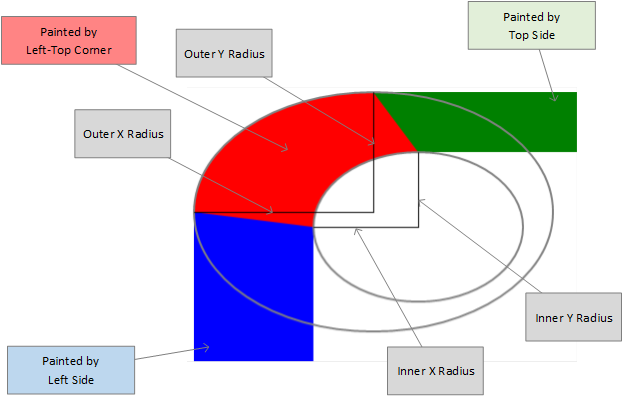
Besides filling and outlining, the border corners define the corner rounding of the final border geometry. Each border corner has four properties:
- InnerXRadius, InnerYRadius - define the X and Y radiuses of the ellipse that defines the curvature of the inner rounded corner.
- OuterXRadius, OuterYRadius - define the X and Y radiuses of the ellipse that defines the curvature of the outer rounded corner.
The following image illustrates a border corner with different inner and outer X and Y radiuses for a left-top corner:

figure 2. Corner rounding
NOV exposes several static methods of the NBorder that can help you create predefined borders. The following table describes some of them:
| Method |
Description |
|
Filled Borders
|
|
CreateFilledBorder
|
Creates a border that fills the border area with a homogenous filling. Has overloads for creating a border with inner and outer outlines, as well as with corner rounding. |
|
3D Borders
|
|
Create3DBorder
|
Creates a border that mimics the 3D effect of standard Windows themes. |
|
CreateSunken3DBorder
|
Creates a sunken 3D border by a provided UI Theme Color map |
|
CreateRaised3DBorder
|
Creates a sunken 3D border by a provided UI Theme Color map |
|
Outline Borders
|
|
CreateOuterOutlineBorder
|
Creates a border that strokes the outer outline of the border wall. Has overloads for creating a border with corner rounding. |
|
CreateInnerOutlineBorder
|
Creates a border that strokes the inner outline of the border wall. Has overloads for creating a border with corner rounding. |
|
Multi Color Borders
|
|
CreateTwoColorBorder
|
Creates a border that consists of two stripes - outer and inner. The outer and inner stripes are filled with used specified colors. Has overloads for creating a border with corner rounding. |
|
CreateThreeColorBorder
|
Creates a border that consists of three stripes - outer, middle and inner. The outer, middle and inner stripes are filled with used specified colors. Has overloads for creating a border with corner rounding. |
The following code example creates a red border and applies it to a button:
| Predefined Border Example |
Copy Code
|
NButton button = new NButton("Button with border");
button.BorderThickness = new NMargins(10);
button.Border = NBorder.CreateFilledBorder(NColor.Red);
|


