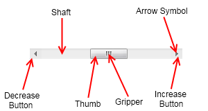
Scrollbars are range based widgets, which come in handy when you need to display large content in a limited area on screen. The scrollbars let the user change the currently visible part of this large content by dragging a thumb or clicking an arrow button. The following image illustrates the structure of a NOV scrollbar:

Depending on their orientation scrollbars can be horizontal (represented by the NHScrollBar class) and vertical (represented by the NVScrollBar class). Typically when you want to show large content in a smaller area you will not need to manually measure the content, configure and attach scrollbars to it. NOV makes this much more easier – simply place the content in a scroll content element.
