The group box is represented by the NGroupBox class.
The group box is a widget that consists of 2 child widgets – Header and Content. Here’s an example of a group box that contains a button:
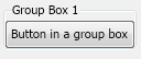
This group box was created with the following code:
| Simple group box example |
Copy Code
|
NButton button = new NButton("Button in a group box");
NGroupBox groupBox = new NGroupBox("Group Box 1", button);
|
You can also change the placement of the header and add more widgets by first placing them in a panel:
To control the horizontal alignment of the group box header, use the HorizontalPlacement property.
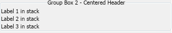
This group box was created with the following code:
| Group box with centered header example |
Copy Code
|
NGroupBox groupBox2 = new NGroupBox("Group Box 2 - Centered Header");
groupBox2.Header.HorizontalPlacement = ENHorizontalPlacement.Center;
m_ContentPanel.Add(groupBox2);

NStackPanel stack = new NStackPanel();
groupBox2.Content = stack;

stack.Add(new NLabel("Label 1 in stack"));
stack.Add(new NLabel("Label 2 in stack"));
stack.Add(new NLabel("Label 3 in stack"));
|
If you need a group box without a header, do not set the header text of the group box (or set it to null or an empty string) and set the group box header margins to zero:
| Group box without header |
Copy Code
|
NGroupBox groupBox = new NGroupBox();
groupBox.Header.Margins = NMargins.Zero;
groupBox.Content = new NLabel("Group box content");
|
The following is a group box that shows and expand/collapse symbol in its header and allows the user to click this symbol to epand/collapse the group box:
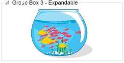
To create a group box that can be collapsed and expanded, set its Expandable property to true. For example:
| Create an expandable group box |
Copy Code
|
NGroupBox groupBox3 = new NGroupBox("Group Box 3 - Expandable");
groupBox3.Expandable = true;
groupBox3.Content = new NImageBox(NResources.Image_Artistic_FishBowl_jpg);
|