User Interface / Widgets / Containers / Scroll Content Element
Scroll Content Element

The scroll content element can be used to show large content in a smaller area. It automatically measures the content and configures and attaches scrollbars to it if necessary. All you have to do is to place the content in a scroll content element.

 Properties

The scroll content element provides the following properties:

  • HScrollBar and VScrollBar - references to the horizontal and vertical scrollbars of the scroll content element.
  • HScrollMode and VScrollMode - control the scroll mode, which specifies the visibility of the horizontal/vertical scrollbar. Can be one of the following:
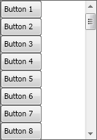
    Scroll Mode Description
    Never Scrollbars are never shown.
    Always Scrollbars are always shown.
    WhenNeeded Scrollbars are shown only when needed. This is the default value.
  • NoHScrollAlign and NoVScrollAlign - specify the horizontal/vertical content alignment, when a horizontal scrollbar is not, or must not be displayed.
  • SmallHScrollChange and SmallVScrollChange - determine the horizontal and vertical small scroll changes respectively.

 Code Example

The following is a simple example that creates 50 buttons in a stack panel and places the panel in a scroll content element:

Scroll Content Element Example
Copy Code
NStackPanel stack = new NStackPanel();
for (int i = 1; i <= 50; i++)
{
    stack.Add(new NButton("Button " + i.ToString()));
}
 
NScrollContent scrollContent = new NScrollContent();
scrollContent.Content = stack;

This code will produce the following result:


See Also