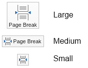
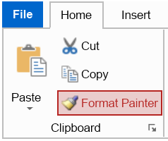
Ribbon buttons extend regular buttons with support for ribbon widget states:

For each ribbon button you can specify LargeImage, SmallImage and Text. You can also specify the spacing between the image and the text using the ImageTextSpacing property. For convenience, most ribbon widgets provide static "Create" methods, which can be used to quickly create instances of the specific ribbon widget and the ribbon button is no exception. The following code example shows how to create a button in small initial state:
| Ribbon Button in Small Initial State |
Copy Code
|
|---|---|
NRibbonButton button = NRibbonButton.CreateSmall("Decrease Indent", NResources.Image_16x16_paragraph_indent_left_png);
|
|
Besides ribbon buttons, Nevron Open Vision also provides ribbon toggle buttons and ribbon repeat buttons, implemented by the NRibbonToggleButton class and the NRibbonRepeatButton class respectively. They behave just like regular toggle buttons and repeat button, but also provide support for ribbon widget states and small and large image like the ribbon buttons.

