Ribbon Galleries
In This Topic
Ribbon galleries are scrollable lists of items where each item represents the effect of clicking it visually instead of only holding a static icon like a button.
Parts

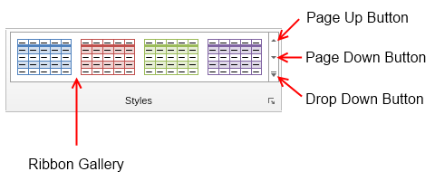
The content of the gallery is a table picker and can be set through the TablePicker property. At the right side of each gallery is placed a spinner, which contains three buttons: page up, page down and drop down button. The page up and page down buttons are used to scroll the table picker up and down respectively, while the drop down button shows a popup that contains the whole table picker expanded.
You can use the MinimumPopupColumnCount property to specify the number of table picker columns to show for the table picker in the popup. The popup can also have a menu at the bottom. To set and configure it, use the PopupMenu property of the ribbon gallery.
States and Sizing
Unlike other ribbon widgets, ribbon galleries may have many more than the standard three states: Large, Medium and Small. Ribbon galleries have multiple intermediate states between the Medium and Large state - one state for each cell above the minimum number of columns allowed for the gallery, which is controlled through the MinimumColumnCount property.
When at Large state, the ribbon gallery expands as much as possible and shows as much items as possible. As the ribbon size decreases, the size of the gallery also decreases with one item at a time until the gallery fits in the available space. When the gallery reaches Medium state, which happens when only MinimumColumnCount items (by default set to 3) are shown and there's still not enough space, then the gallery goes into Small state (in case of ribbon galleries also know as Collapsed state).
In Small (Collapsed) state no items are shown, but rather a drop down button, which when clicked shows the ribbon gallery in a popup window - see the image below. The image and the text of this state of the ribbon gallery are set through the Icon and Text properties respectively. They can also be passed as parameters to the ribbon gallery constructor.

Example
The code example shows how to create and configure a ribbon gallery:
| Create and Configure Ribbon Gallery |
Copy Code
|
NRibbonGallery gallery = new NRibbonGallery("Table Style", NResources.Image_32x32_table_design_png, new NTableStylePicker());
gallery.MinimumPopupColumnCount = 7;

gallery.PopupMenu = new NMenu();
gallery.PopupMenu.Items.Add(new NMenuSeparator());
gallery.PopupMenu.Items.Add(new NMenuItem("Modify Table Style..."));
gallery.PopupMenu.Items.Add(new NMenuItem("New Table Style..."));
|
The code will result in a ribbon gallery that hosts a table style picker and shows 7 columns in the popup that opens when the drop down button is clicked. The popup window will also have a menu with 2 items at the bottom of this popup window.
See Also


