Nevron Open Vision Documentation
User Interface / Widgets / Command Bars / Menu Bars and Menus
In This Topic
    Menu Bars and Menus
    In This Topic
     Menu Bars

    Menu bars are represented by the NMenuBar class, that derives from NCommandBar. Menu Bars are not additing any new functionality to Command Bars, but are often used as a type target in styling to distingush them. The FillLane and Wrappable properties for menu bars are by default set true.

    As menu bars are command bars you can place any type of widget inside them. In most cases however you will populate menu bars with menu drop downs, like shown in the following image:

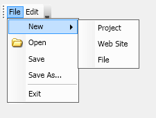
    figure 1. Menu Bar with Menu Drop Downs.

    The menu bar shown above was be created with the following code:

    Menu Bar Example
    Copy Code
    NMenuBar menuBar = new NMenuBar();
    NMenuDropDown fileMenu = new NMenuDropDown("File");
    menuBar.Items.Add(fileMenu);
     
    NMenuItem newMenuItem = new NMenuItem("New");
    fileMenu.Items.Add(newMenuItem);
    newMenuItem.Items.Add(new NMenuItem("Project"));
    newMenuItem.Items.Add(new NMenuItem("Web Site"));
    newMenuItem.Items.Add(new NMenuItem("File"));
     
    NImage fileOpenImage = new NImage(new NUri(@"C:\FileOpen.png"));
    fileMenu.Items.Add(new NMenuItem(fileOpenImage, "Open"));
    fileMenu.Items.Add(new NMenuItem("Save"));
    fileMenu.Items.Add(new NMenuItem("Save As..."));
    fileMenu.Items.Add(new NMenuSeparator());
    fileMenu.Items.Add(new NMenuItem("Exit"));
     
    NMenuDropDown editMenu = new NMenuDropDown("Edit");
    menuBar.Items.Add(editMenu);
     
    editMenu.Items.Add(new NMenuItem("Undo"));
    editMenu.Items.Add(new NMenuItem("Redo"));
    editMenu.Items.Add(new NMenuSeparator());
    editMenu.Items.Add(new NMenuItem("Cut"));
    editMenu.Items.Add(new NMenuItem("Copy"));
    editMenu.Items.Add(new NMenuItem("Paste"));
    
     Menu and Menu Drop Down

    The NMenuDropDown is a a popup window host (derives from NMenuPopupHost), the popup context of which is a NMenu. As NMenuItem also derive from NMenuPopupHost, the core menu navigation features are integrated inside the NMenu and NMenuPopupHost widgets.

    Altough the NMenu is a widget, in most cases you will use it indirectly, when creating menu drop downs and menu items. The items of a NMenu can be any widget, but in most cases you will populate it with menu items.

    Both menu items and menu drop downs are similar to buttons in the fact that they raise a Click event. The Click event is raised in response to the following user gestures:

    • Mouse Down - if the mouse is down inside the widget and the ClickMode is set to MouseDown.
    • Mouse Up - if the mouse is up inside the widget and the ClickMode is set to MouseUp.
    • Enter key - when the widget and the Enter keyboard key is pressed.

    The following example handles the click event of a menu item:

    Menu Item Click

    Copy Code
    menuItem.Click += new Function<NEventArgs>(OnThemeMenuItemClick);
    
    private void OnMenuItemClick(NEventArgs arg1)
    {
        NMenuItem item = (NMenuItem)arg1.TargetNode;
    }
    
     Menu Items

    Menu items are represented by the NMenuItem widget. Each menu item consists of the following parts:

    Name Description
    Header Defines the widget to use as menu item header.
    Content Defines the widget to use as menu item content.

    When placed inside a NMenu, the header and content of a menu item are automatically aligned to the other menu items header and content.

    The NCheckableMenuItem class represents a menu item, which is preceded by a check symbol. The Checked property of the checkable menu item specifies whether the menu item is considered checked or not.

    See Also