Symbol toggle buttons are toggle buttons that consist of a symbol and content. The SymbolContentRelation property controls position of the symbol in relation to the content and the Spacing property determines the distance between them. Typical examples for symbol toggle buttons are the check box and the radio button.
A check box is toggle button that allows the user to make a binary choice. It is represented by the NCheckBox class. The following example demonstrates how to create and use a check box:
| Check Box Example |
Copy Code
|
|---|---|
... NCheckBox checkBox = new NCheckBox("Check Me"); checkBox.CheckedChanged += new Function<NValueChangeEventArgs>(OnCheckChanged); ... void OnCheckChanged(NValueChangeEventArgs arg) { NCheckBox checkBox = (NCheckBox)arg.TargetNode; Console.WriteLine("Check changed to: " + checkBox.Checked); } |
|
A radio button is a toggle button, that allows the user to choose only one of a predefined set of options. It is represented by the NRadioButton class. To be fully functional the radio button must be a descendant of a NRadioButtonGroup. The radio button group is a content element (i.e. can hold any other widget), that allows only one of the radio buttons that reside in its sub-hierarchy to be selected at a time. This allows for radio buttons to have arbitrary arrangement. The following code example creates a comples layout of radio buttons and places them inside a radio button group:
| Radio Buttons Example |
Copy Code
|
|---|---|
NStackPanel vstack1 = new NStackPanel(); vstack1.Add(new NRadioButton("Intel")); vstack1.Add(new NRadioButton("AMD")); NStackPanel vstack2 = new NStackPanel(); vstack2.Add(new NRadioButton("NVidia")); vstack2.Add(new NRadioButton("ATI")); NStackPanel hstack = new NStackPanel(); hstack.Direction = ENHVDirection.LeftToRight; hstack.Add(vstack1); hstack.Add(vstack2); NRadioButtonGroup radioGroup = new NRadioButtonGroup(new NGroupBox("Select your video card vendor", hstack)); |
|
This code produces the following radio button group:
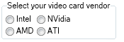
The NRadioButtonGroup class inherits from the generic NToggleButtonGroup<T>, which exposes a SelectedIndex property. The SelectedIndex indicates the index of the currently selected radio button in the group subtree depth first traversal order. In our case the indices of the options are:
0 - Intel
1 - AMD
2 - NVidia
3 - ATI
The SelectedIndexChanged event is raised when the currently selected item has changed. The SelectedItem property returns the currently selected radio button.