UI Themes Overview
In This Topic
The base class of all NOV UI themes is the NUITheme class, which derives from NTheme. This means that NOV UI is generally styled with DOM themes, which are described by the DOM Themes topic.
Currently there are two general types of UI themes as seen from the following image:
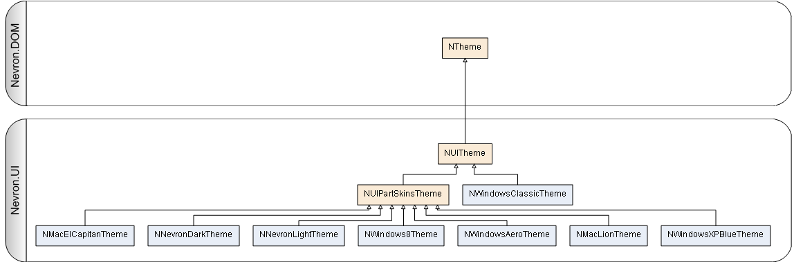
The NUITheme class defines the most commonly used UI states and contexts that are used by UI themes. The UI theme also exposes two maps:
- Colors - the colors map is an instance of the NUIThemeColorMap class. It represents a palette with colors used by the theme.
- Fonts - the fonts map is an instance of the NUIThemeFontMap class. It represents a set of fonts that are used by the theme.
Both maps are initialized from a value of the ENUIThemeScheme enumeration, which defines the basic color and font presets for a UI theme. Vector themes (such as the NWindowsClassicTheme) typically use only these template resources to construct the theme. Image base themes (for example NWindowsAeroTheme) additionally use images to define the appearance of certain UI elements.
Using UI Themes
To apply a UI theme to your application, call the ApplyTheme method of NApplication in the entry point of your application (e.g. in the Main method in the "Program.cs" file for a WinForms application) just after NOV has been installed and initialized:
| Apply a theme |
Copy Code
|
NApplication.ApplyTheme(new NWindows8Theme());
|
For more information about using UI themes take a look at the Using UI Themes topic.
Custom Themes
The NUITheme also provides abstract methods that should style a specific type of widgets (e.g. CreateWindowStyles(), CreateButtonStyles(), etc.). When you create custom themes, you should override all of them if you inherit from NUITheme or the ones you want to style yourself, if you inherit from one of the NUITheme derived themes. The following example overrides the buttons of the default Windows Aero theme:
| Custom Theme Example |
Copy Code
|
public class MyCustomTheme : NWindowsAeroTheme
{
    public MyCustomTheme()
    {
    }
    protected override void CreateButtonStyles()
    {
        // buttons are yellow by default and with 1 dip border
        NThemeSkin skin = GetSkin(NButtonBase.NButtonBaseSchema);
        skin.Set(NWidget.BackgroundFillProperty, new NColorFill(NColor.Yellow));
        skin.Set(NWidget.BorderThicknessProperty, new NMargins(1));
        // buttons have a red border when pressed and blue background
        NThemeStyle pressedStyle = skin.GetStyle(IsPressedState);
        pressedStyle.Set(NWidget.BackgroundFillProperty, new NColorFill(NColor.Blue));
        pressedStyle.Set(NWidget.BorderProperty, NBorder.CreateFilledBorder(NColor.Red));
    }
}
|
For more information on how to create custom themes, check out the Custom Themes documentation topic.
The NOV Themes are available in full source code, which can be downloaded from
this link. The easiest way to build a custom theme is to simply modify one of the existing ones.
See Also