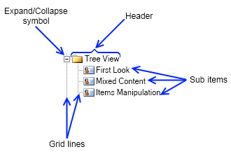
The tree view is a widget that presents a hierarchical view of a set of items. Each item can have a number of sub items and can be expanded to show them or collapsed to hide them. To add or remove items to the tree view you can use its root item collection – Items. Each individual item also provides an item collection, which lets you easily add/remove sub items.
The tree view provides the following properties:
The tree view item is a widget, which consists of an expand/collapse symbol, a header and a collection of sub items.

Each tree view item provides the following properties:
- IsSelected - gets whether the item is selected or not. Automatically updated by Nevron.
- Expanded - indicates whether the tree view item is expanded (i.e. its sub items are visible) or not. When the value of this property changes the ExpandedChanged event is fired.
- Symbol - a reference to the expand/collapse symbol of the tree view item.
- Header - a content element that represents the header of the tree view item. It can host any widget, for example to create a tree view with image and text you can set a pair box with the image and the text as the content of the tree view item's header.
- Items - the items collection of the tree view item. You can use its methods to add/remove subitems to the tree view item.
- ParentItem - gets the tree view item that holds this tree view item. If the value of this property is null this means that the item is in the root collection of items of the tree view.
- IndexInParent - indicates the zero based index of the tree view item in the Items collection of its parent or -1 if the item has no parent (i.e. it is in the root collection of items of the tree view).
- OwnerTreeView - reference to the tree view widget the tree view item is part of or null if the tree view item is not placed in a tree view.
- GridlinesStroke - defines the stroking of the grid lines.
The code example below demonstrates how you can create a checkable tree view item, which has an image and a text:
| Advanced Tree View Item |
Copy Code
|
NStackPanel stack = new NStackPanel();
stack.Direction = ENHVDirection.LeftToRight;
stack.HorizontalSpacing = 3;

stack.Add(new NCheckBox());
NImage image = new NImage(new NUri(@"C:\MyImage.png"));
stack.Add(new NImageBox(image));
stack.Add(new NLabel("Tree View Item"));
NTreeViewItem item = new NTreeViewItem(stack);
|
The code below demonstrates how to create a simple tree view with a few items and sub items and how to subscribe and handle the SelectedPathChanged event:
| Tree View Creation and Event Handling |
Copy Code
|
NTreeView treeView = new NTreeView();
for (int i = 1; i <= 5; i++)
{
    NTreeViewItem item = new NTreeViewItem("Item " + i.ToString());
    treeView.Items.Add(item);

    for (int j = 1; j <= 3; j++)
    {
        NTreeViewItem subItem = new NTreeViewItem("Item " + i.ToString() + "." + j.ToString());
        item.Items.Add(subItem);
    }
}

treeView.SelectedPathChanged += new Function<NValueChangeEventArgs>(OnTreeViewSelectedPathChanged);

private void OnTreeViewSelectedPathChanged(NValueChangeEventArgs arg1)
{
    // Get the tree view
    NTreeView treeView = (NTreeView)arg1.CurrentTargetNode;

    // Get the selected item
    NTreeViewItem selectedItem = treeView.SelectedItem;
}
|

