In NOV tooltips are implemented via a dynamic top-level window that appears above the window, to which the tooltip belongs. This means that the tooltips management is not a responsibility of the NOV hosts. As long as the NOV host provides the Windows Manager features that NOV requires, tooltips will simply work. NOV is therefore responsible for both the update of the currently active tooltip as well as the management of the tooltip window created for the shown tooltip.
NMouse opens a tooltips requests session prior to raising the Move event, and closes the session after the event is raised. It is up to the DOM to request the tooltip that it wishes by calling the NMouse.RequestToolTip method during an opened tooltip requests session. The first tooltip that was requested during a tooltip request session is shown over the window, for which the Move event is dispatched. You can query whether it makes sense to call NMouse.RequestToolTip by first calling NMouse.CanRequestToolTip – it returns false if a tooltip requests session is not opened or a tooltip was already requested for this session.
A higher level support for tooltips is implemented by the NInputElement class, which allows you to specify its tooltip by simply setting its ToolTip property (see Input Elements for more info).
Tooltips are usually shown after a certain periods of time. This is a simple user experience consideration that gives the user the needed time span to leave the element that is actually requesting a tooltip, and thus abort the showing of a requested tooltip. Suppose that you have a toolbar with many buttons. If the user moves the mouse relatively quickly around the toolbar buttons - the application does not need to bother him constantly with tooltips, since tooltips should be used to provide additional information about certain elements. On the other hand, if the user slows over a certain button, then most likely he does not know what this button does - so a tooltip will show, giving additional information.
NCursor provides two properties that let you control the show delays - FirstShowDelay and NextShowDelay. When a tooltip is requested, NMouse first checks to see whether there is another tooltip currently shown. If there is no other tooltip, it waits for the FirstShowDelay time interval, prior to showing the requested cursor. If there is another tooltip currently shown, it waits for the NextShowDelay time interval prior to showing the requested cursor.
Tooltips are automatically hidden. After a tooltip has been shown, NMouse waits for the tooltip ShowDuration period to elapse prior to automatically closing the tooltip.
A tooltip can also be prematurely hidden, if any of the following events occur:
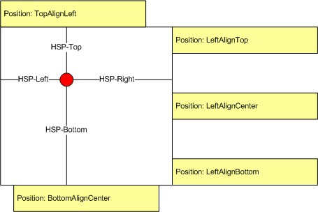
A tooltip is automatically positioned close to the current mouse position at the time of showing (not request). Because a tooltip needs to be shown close the mouse position, but never over it (in order not to obscure the content below the mouse pointer), the tooltip defines the notion of a virtual cursor and aligns relatively to this virtual cursor. The alignment of the tooltip relative to the virtual cursor is specified by the Position property. The virtual cursor dimensions are specified by the HotSpotPadding property – it defines the padding around the mouse position. The following image shows how the Position and HotSpotPadding work together to define the tooltip positioning around the mouse position:
By default the tooltip, once shown will not follow the mouse. You can instruct it to do so by setting its FollowMouse property to true.
The content of the tooltip is the NWidget provided by the GetContent virtual method of the NToolTip. This means that the content of a tooltip can be any widget, and can be provided at the time the tooltip is shown. By default the GetContent method returns the NWidget that is provided by the NWidget.FromObject method - the argument that is passed is the Content property value of the tooltip. The Content property is an object that is typically assigned to be either a text string or a widget. The following example shows how to create a simple text tooltip and also a tooltip with rich content (can be any widget):
| Creating ToolTips with Different Content |
Copy Code
|
|---|---|
// create simple text tooltip NToolTip textToolTip = new NToolTip("I am a simple text tooltip"); // create rich content tooltip NStackPanel richTooltipContent = new NStackPanel(); richTooltipContent.Add(new NLabel("The tooltip can contain any type of Nevron Open Vision Content")); richTooltipContent.Add(new NImageBox(NResources.Image__48x48_Book_png)); NToolTip richToolTip = new NToolTip(richTooltipContent); |
|
A powerful feature is the ability to override the GetContent() method of the tooltip. The example below shows not only the content of the tooltip, but also the time the tooltip was opened:
| Dynamic ToolTip that Shows the Time When It Was Opened |
Copy Code
|
|---|---|
NButton button = new NButton("My Button"); button.ToolTip = new DynamicToolTip("I'm a dynamic tooltip"); ... public class DynamicToolTip : NToolTip { public DynamicToolTip() { } public DynamicToolTip(object content) : base(content) { } public DynamicToolTip(DynamicToolTip source) : base(source) { } static DynamicToolTip() { DynamicToolTipSchema = NSchema.Create(typeof(DynamicToolTip), NToolTip.NToolTipSchema); } public override NWidget GetContent() { NWidget widget = base.GetContent(); string timeString = "This tooltip was shown at " + DateTime.Now.ToLongTimeString(); NPairBox pairBox = new NPairBox(widget, timeString, ENPairBoxRelation.Box1AboveBox2, false); return pairBox; } public static readonly NSchema DynamicToolTipSchema; } |
|