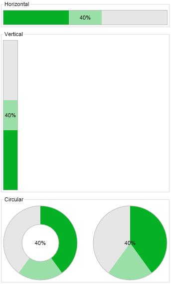
The progress bar is a widget that fills to indicate the progress of an operation. The Style property determines whether it is horizontally or vertically oriented or whether it is circular. The Minimum and Maximum properties (by default set to 0 and 100 respectively) determine the start and the end of the operation and the Value property indicates its current progress. Through the LabelStyle property you can control whether a progress label is shown and how its value is formatted if yes.
Horizontal and Vertical Progress Bars
The following example that demonstrates how to create a horizontal progress bar:
| Horizontal Progress Bar |
Copy Code
|
NProgressBar progressBar = new NProgressBar();
progressBar.PreferredSize = new NSize(300, 30);
progressBar.Style = ENProgressBarStyle.Horizontal;
progressBar.Value = 40;
|
This code will produce the following result:

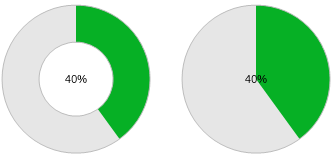
Besides the settings mentioned above circular progress bars lets you specify one more setting - the size of the rim in relation to the circular progress bar radius. The following code creates 2 circular progress bar with differenet RimWidthPercent values - the first one has a rim width of 50% (the default) and the second one has a rim width of 100%.
| Circular Progess Bars |
Copy Code
|
// Circular progress bar - 50% rim
circularProgressBar1 = new NProgressBar();
circularProgressBar1.Style = ENProgressBarStyle.Circular;
circularProgressBar1.Value = 40;
circularProgressBar1.PreferredSize = new NSize(150, 150);

// Circular progress bar - 100% rim
circularProgressBar2 = new NProgressBar();
circularProgressBar2.Style = ENProgressBarStyle.Circular;
circularProgressBar2.Value = 40;
circularProgressBar2.RimWidthPercent = 100;
circularProgressBar2.PreferredSize = new NSize(150, 150);
|

The NOV progress bar has a Mode property which determines the mode of the progress bar and can be:
- Determinate - the progress bar shows the progress of an operation from 0 to 100%. This is the default mode and is shown on the screenshots above.
-
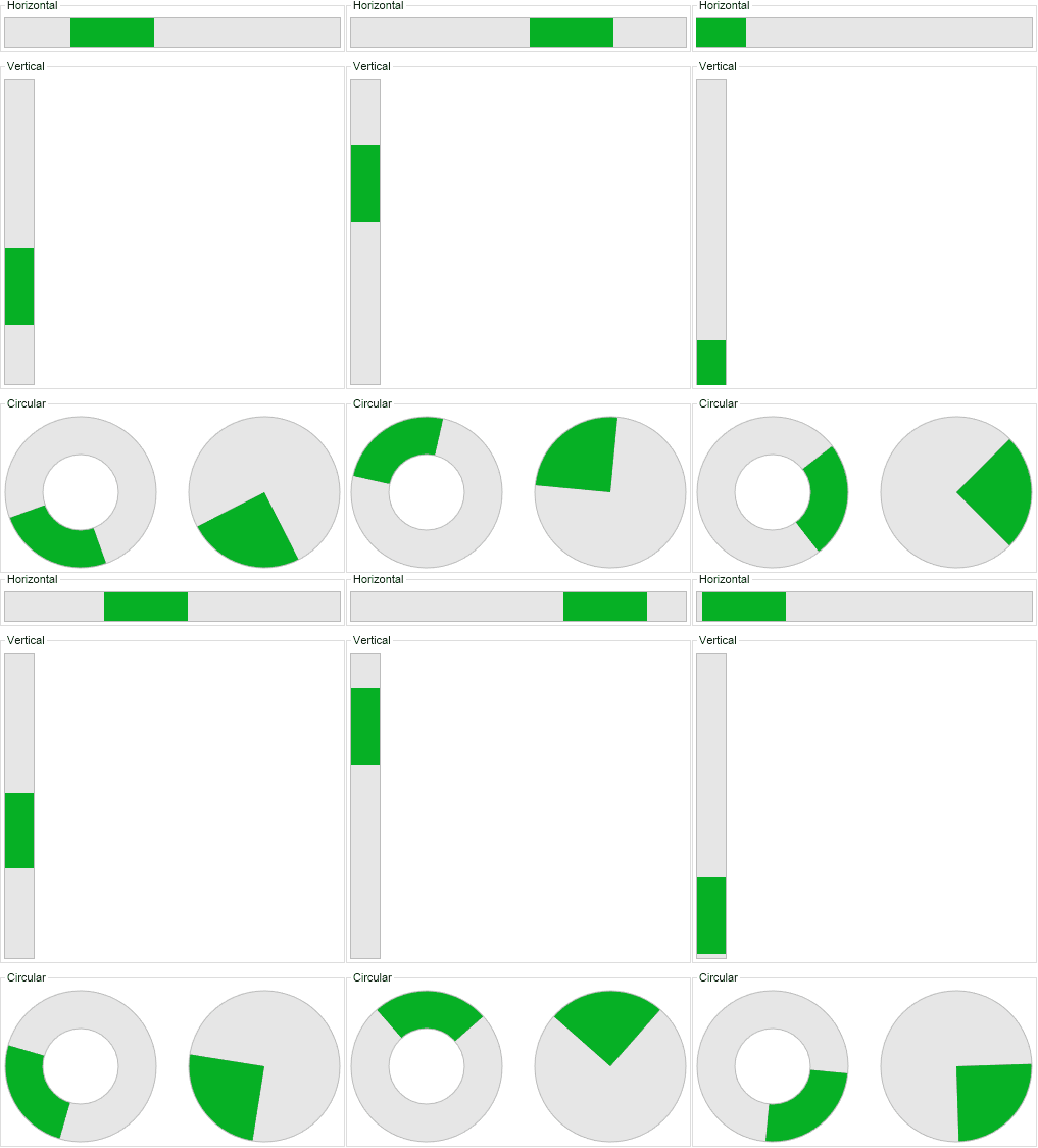
Indeterminate - the progress bar shows an animation indicating that a long-running operation is executing. No specific progress is shown. This mode should be used for operations whose progress cannot be estimated, for example a long-running database query:

-
Buffered - the progress bar shows the progress of an operation from 0 to 100%. It also additionally shows the buffered value of the operation with a lighter color. The buffered value is specified through the BufferedValue property:
